12 Warning Signs Your Business Needs a Website Redesign
When was the last time you updated your business website?
We're not just talking about adding some photos of your shop or publishing a blog post.
We mean - when did you last look at your online presence and really think about whether your current site is effectively serving you and your business?
Having an up-to-date, well-designed and functional website is an integral part of every marketing strategy.
So, if your website shows any of the 12 warning signs below, you may need a website redesign strategy ASAP
Warning #1 - Declining Conversion Rates
If your current website gets decent web traffic but few sales or subscribers, it's time to look at why.
An outdated or ineffective website can lead to declining conversion rates.
In today's market, customers expect brands to be industry leaders and well adapted to current trends. Website visitors can determine at a glance whether your web page or online store is a thing from the past. Even worse, customers might consider an outdated online store to be "unsafe" with their financial information.


Signs of declining conversion rates
- High bounce rates
- Low time-on-page
- Moderate/high traffic but low sales
How a website redesign solves this
Redesigning your website shows your target audience that your business is current and excited about meeting customer expectations.
Consider your business goals and determine if your existing site fulfils them.
What could you be doing to inspire or move your customers towards a purchasing decision? How would a new design with improved functionality and security better serve your business?
When you change the way your website looks and how it works, it becomes more appealing and easier for visitors to use. Helpful site navigation, engaging copy, and attractive pictures all work together to build trust and get their attention.
More engaged website visitors will do what you want them to do, like buying, signing up, or filling out a form.
Warning #2 - Poor User Experience (UX)
User behaviour and experience are central to whether a website succeeds.
Site visitors want to find the information they need quickly and easily.
Whether finding a way to contact your business, finding information in a blog or article, or buying a product, customers don't want to spend any more time than necessary on the task at hand.
Creating a simple and streamlined website is essential for delivering a positive online experience to your intended audience.
Additionally, site performance that's fast and efficient means a reduction in user frustration and a higher likelihood that your website's visitors will return.
It's also crucial to keep your list of products and services up to date to cater to visitors who are seeking to fulfil specific desires or requirements.
After all, if no one knows what you sell, how can they be expected to buy it?

Signs of poor UX
- Confusing navigation
- Broken links
- Outdated product or service information
How a website redesign solves this
By keeping your website up-to-date, you demonstrate to customers that your business is actively functioning and also flourishing.
A fresh website interface also signals to customers that you have the most relevant information or products on the market.
Additionally, modern web designs are created to support rapid and accessible online experiences.
Warning #3 - Low Search Engine Rankings
Search engines filter millions upon millions of websites every day.
Getting to the top of Google's search results page might seem like an impossible task, but it's not.
For old and outdated websites, you might see your rankings gradually decline over time as web traffic falls month by month.
However, if you see this, all is not lost!
Creating fresh content with the right target keywords can propel your website's search engine rankings to the top.
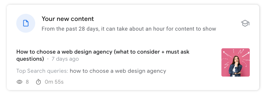
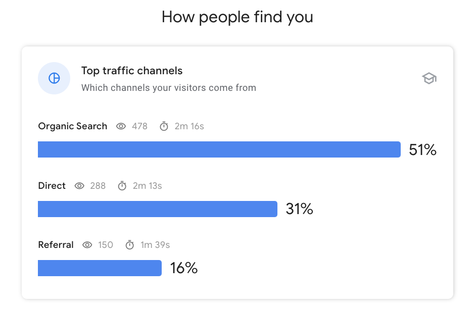
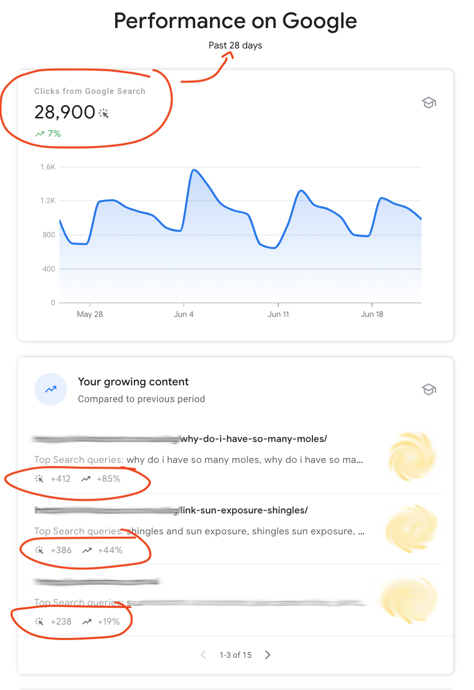
Here's an example of fresh content not only ranking quickly but also raising the site organic traffic channels.


Signs of low search engine rankings
- Low traffic on site
- Can't find your own website in Google search
- Decreasing organic traffic over time
How a website redesign solves this
If your goal for a website redesign is to enhance your search rankings, the most effective approach is to collaborate with a web design agency that also specialises in digital marketing. They'll help you understand what Google is looking for and how to skyrocket your website visibility to the #1 position in search results.
Creating fresh content, updating links, and avoiding duplicate content are additional strategies that can significantly boost your search rankings. By implementing these practices, you enhance the relevance and credibility of your website in the eyes of search engines.
When developing a website redesign plan, incorporate your brand identity and ensure that your business information is up to date. By creating a seamless and visually appealing online experience, you greatly increase the likelihood of turning your site visitors into loyal, repeat customers.
Warning #4 - It Un-ironically Looks Like it Was Made in the 2000's
Retro might be all the rage in music and fashion, but when it comes to the internet, it's best to leave the past in the past.
Your landing page is your first chance to captivate your target customers. And you have 8 seconds or less to do this.
A cluttered layout with too many menu options and too much content dumping will only encourage potential customers to look elsewhere. On the other hand, if your website design is too minimal, your visitors may not find what they are looking for and ultimately leave the page.
Additionally, broken links, inaccurate search results and confusing calls to action are all too common features of old websites. Any one of these elements can harm your customer conversion rates.
A website redesign project will cut out this clutter and provide a sleek and modern web experience for your users.


Signs your website design is outdated
- Non-responsive layouts
- Excessive use of Flash
- Cluttered web pages
- It looks like a desktop site on your phone
How a website redesign solves this
The redesign process means removing or updating anything that is no longer functional.
Increased and efficient functionality means a more positive online experience for your customers.
By reducing their level of frustration and saving them time, you have a much better chance of converting visitors to paying customers.
Warning #5 - Ineffective or No Calls-to-Action (CTA)
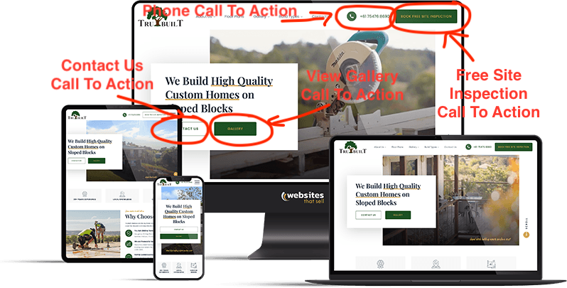
Calls-to-action is how businesses get customers to convert online browsing into action. Whether that action means subscribing to a newsletter, leaving a review or inquiry, or buying a product.
Without an effective and well-placed call to action, your target audience has no incentive to do what you as a business owner want them to do.
They may read your content or browse your product line, but a confusing or outdated layout risks customers not knowing what to do next.
Effective CTAs make it clear to your customers what action they should take on specific pages.
Web designers will understand how the eye is drawn across the page, and a new site design can focus on your business goals and how to achieve them with focused CTAs.

Signs of ineffective calls-to-action
- Unclear or non-compelling language
- Low number of converting users
- CTAs don't stand out or are hidden among content
How a website redesign solves this
One of your redesign goals should be implementing effective calls to action.
Whether it's placed in the hero section or the navigation bar (We use both!), strong calls to action can turn your visitors into customers.
As people read and learn about your business, make it as easy as possible for them to either book your services or buy your products.
For example, putting your phone number or email address at the beginning and end of a page reminds customers to inquire with you directly. After they contact you, you'll be able to complete the sales process by forming a relationship with your customer.
Adding prompts to subscribe to future updates via your mailing list is another effective call to action that will increase brand awareness with your audience as they receive regular email updates from you.
Warning #6 - Incompatibility with Mobile Devices
Mobile phones are an integral part of our modern lives.
Whether we're on the go or simply not at our computers, we typically reach for our phones when immediate information is needed.
If your website isn't mobile-friendly, you risk losing out on a large segment of your audience.
Not only does it make your website look old and outdated, but a mobile-incompatible website means your online presence remains largely inaccessible to many busy people.
And those busy people want a business solution now!
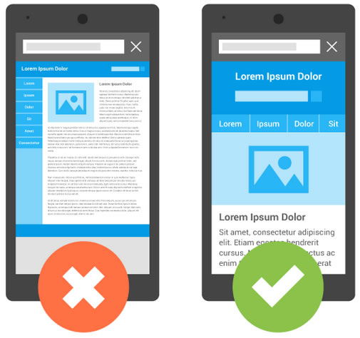
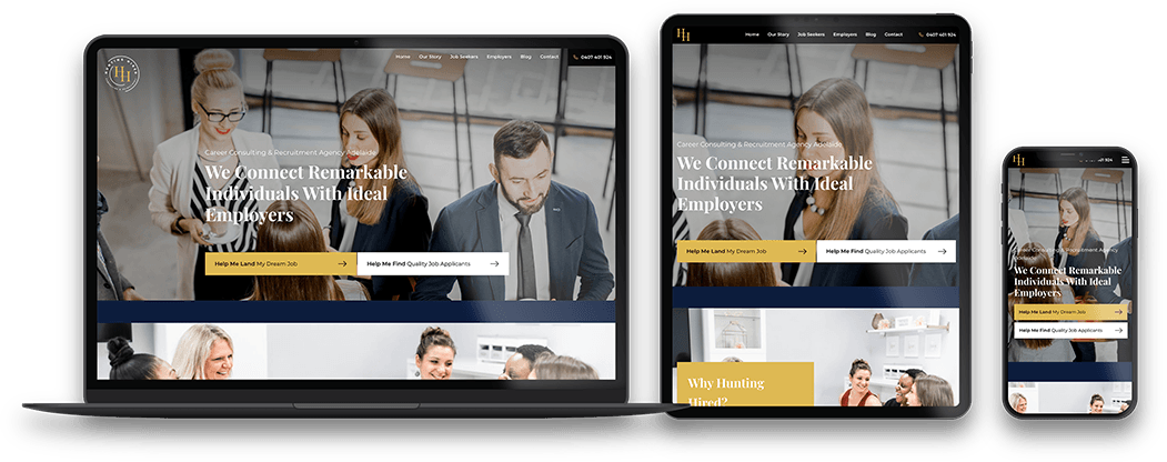
Mobile-friendly websites on the other hand are optimised for mobile devices. This means, your business site can be found anytime, anywhere.


Signs of incompatibility with mobile devices
- Looks the same on a mobile as it does on a computer
- Loads slowly on a mobile device
- Content is hidden or cut off when viewed on a mobile
How a website redesign solves this
By intentionally redesigning website elements to fit a smaller screen, a mobile website significantly enhances the user experience.
Mobile sites share many similar elements with the desktop version, but redesigning your website to be mobile-friendly makes your customers more likely to continue browsing and become aware of your calls to action.
However, mobile compatibility goes beyond just the visual experience.
Mobile-first indexing means that Google ranks a website using the content in the mobile version.
Without a mobile version, your search rankings risk being reduced, and those potential customers that do see your site may quickly move on to websites that are easier to view.
Warning #7 - Low Customer Engagement with Your Brand
A crucial warning sign indicating your website needs redesign is low customer engagement with your brand. When visitors fail to engage with your website actively, it can signify a disconnect between your brand and your target audience.
This lack of engagement may manifest as high bounce rates, low time spent on the site, or minimal interactions such as comments, shares, or form submissions. These indicators suggest that your website fails to captivate and resonate with your visitors, potentially leading to missed conversions and customer loyalty opportunities.
Encouraging customers to interact and actively engage with your brand should be among the most prominent goals of any business.
You can build connections with your audience by creating content that speaks directly to their problems or needs. High engagement means remaining in the forefront of people's minds and being the first business in mind when customers require their needs met.
Here's what this means in terms of traffic to your website if done correctly:

Signs of low brand engagement
- No links to social media
- No email sign up forms
- Chatbots aren't installed
How a website redesign solves this
Your website redesign should cover strategies to attract customers and keep them coming back for more.
Encouraging visitors to subscribe through a mailing list helps build an audience that actively wants to hear about your products and services.
Prominently displaying links to social media is another fantastic way to make sure your brand remains in the public focus.
Social media is a great platform for interacting with your customers, answering their questions, and keeping them up to date on your latest offerings.
Warning #8 - Customers can't find what they're looking for
A website that doesn't quickly and clearly provide the information your audience needs to take action may be in dire need of a website redesign strategy.
For example, outdated websites can easily become bloated with content when old information isn't archived and when new information is piled up on top of the old.
When this happens, you risk-relevant information or records becoming lost or buried.
Or, maybe your business's products or services have changed since you first set up your website years ago but your inventory hasn't been updated.
Then, when customers search your website for information, there's none to be found!

Signs customers can't find what they need
- Low customer conversion
- More time spent on home or landing pages; less on product pages
- Decreased sales
How a website redesign solves this
The website redesign process will help you clarify what actions you want customers to take. Once you decide this, you can plan out an easy-to-navigate user interface to lead your audience to the right places.
By putting your most prominent products or services where they can be clearly seen, your customers will be able to quickly and easily discover whether your business is right for them.
If your website includes a search feature, test its functionality to make sure users can find what they're looking for. If it doesn't work, ask your website designer to fix it as part of your website redesign process.
Warning #9 - You've Outgrown Your Website Builder or Platform
Platforms like WIX and Squarespace can be great places to start when first designing a business website.
But as your business grows, so too do your online needs.
These types of web-building platforms don't always include the full functionality, plug-in options, or tools you need to generate revenue and accurately report on your audience.
While website builders are great places to start, the ease with which they can be used comes with the cost of limitations of functionality.
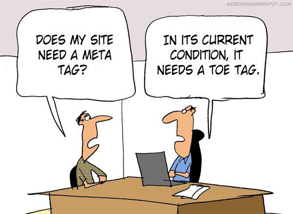

Signs you've outgrown your website builder
- You need more e-commerce functionality
- You wish you could change things that your website builder doesn't offer
- You feel your current website feels too generic or limited
How a website redesign solves this
Website redesigns take into account the full spectrum of functionality that your business needs to thrive.
During a website redesign, ask yourself if there are any features that your current platform doesn't offer. Discuss this with your website developer to see if it's time to move over to a more customisable CMS like Wordpress or Shopify. These platforms give you greater freedom in your website design, branding, and more detailed web analytics.
Asking the question "What do I want my customers to do from the moment my website loads?" is a great way of identifying the areas where you may want to increase your control.
A redesigned website can be tailored to your business's specific needs and goals, including incorporating an online store with a full range of functionality.
Warning #10 - Pages take ages to load
Pages that take too long to load risk not being seen at all. Why aren't your pages loading quickly? Well, there are a few reasons for this.
For example, large image files or pages that are cluttered with outdated design elements can turn a simple click into a long and annoying wait.
High-traffic pages may slow down customer browsing, increasing user frustration and reducing the likelihood of them completing a sales transaction.
When your website loads pages at a rapid speed, it prevents your audience from even considering leaving due to slow loading times. A fast website keeps visitors engaged by swiftly delivering the desired content, ensuring a smooth and efficient user experience.
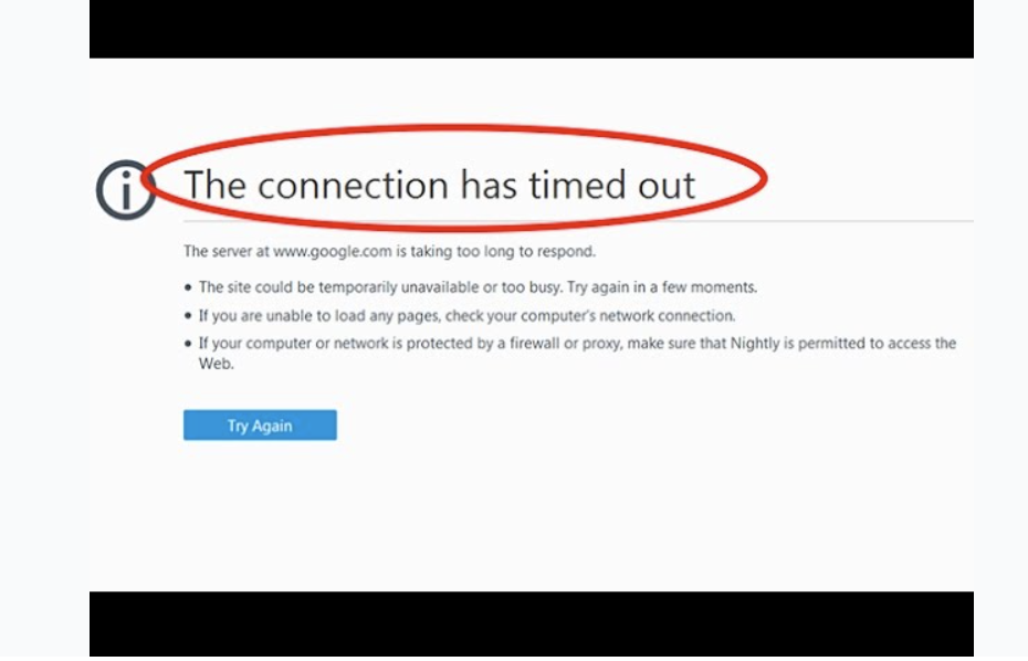

Signs pages take too long to load
- High bounce rate
- It takes longer than 3 seconds to load a page
- Visual elements don't load (images, banners, etc.)
How a website redesign solves this
One of the best website redesign tips is to build a website that quickly guides your visitor from discovering your page to then booking a service or purchasing a product as a customer.
Talk to your web design agency about this to ensure they are planning to create a layout that loads quickly for your users.
Warning #11 - Things that used to work on your website are now broken
Like all technology, websites need maintenance.
Without continual maintenance, site performance will decline as more and more content is added and systems and tools aren't updated.
Outdated versions of tools, plugins and widgets may break down or stop responding entirely and some software, such as Flash, may be obsolete entirely!
Keeping your website updated and functional means that the content you worked so hard to create is accessible to your audience, that is, your potential customer base.


Signs website pages are broken
- Broken links
- Videos or images don't load
- Error messages pop up
How a website redesign solves this
A website redesign makes sure your website is using the most up-to-date software for clear and responsive browsing.
To redesign your website means a chance to re-evaluate and redevelop your site map, or how all of your pages link together, weeding out broken links.
User research may help determine what is still working and what isn't, but a fresh overhaul of your online presence will ensure that all the most recent software is used.
Strong website functionality comes from being completely current and up-to-date.
Warning #12 - Other People Tell You to Get a New Website
If you are getting complaints or comments about your old or outdated website, then it's definitely time to check with a web designer about how to update and refresh your online presence.
An entire website redesign project might seem like a huge process but it doesn't have to be.
Working with an experienced web designer can take the hassle out of updating your web presence, with the knowledge and experience of the latest software tools and design trends.
Web designers can show you how to update your own content or blog through your website's content management system.


Signs other people notice your website needs to be refreshed
- When friends, family or customers ask if you've considered a redesign
- When customers say it wasn't easy to find information or to buy from you
- You clicked on this article wondering whether you need to redesign your website
How a website redesign solves this
Your business is always growing and evolving, but is your web presence doing the same?
Your product inventory or list of services may expand, but does your website?
Your website is just one facet of your business but it is one that needs constant attention.
Looking at redesign examples might help your website redesign projects.
Talk to a website designer today to ask how your old website can get a fresh redesign.
Help! My existing website needs a redesign. What now?
If any of these 12 warning signs have resonated with you, it might be time to redesign your website.
Like all technology, websites age and become outdated over time.
If these warning signs sound like your current website, you may be sitting on a potential gold mine of an opportunity.
The technical aspects can seem overwhelming, but this is where a quality web design agency comes in.
If your next step is choosing an agency, we have a great resource to help you in your search called "How To Choose A Web Design Agency (and how to make sure it's the right one for you!)"
Alternatively, if your next step is to work out a budget, a great next step is to look at the options available and work out what different websites cost. A good guide for this is a post we created called "How Much Does It Cost To Design A Website In Australia?".
Finally, if what you read on this page makes sense and you'd like to talk to one of our experts here at Websites That Sell, we can sit down and have a chat about your website redesign project with you. Whether you're located in Brisbane, the Gold Coast, Sunshine Coast, or anywhere else in Australia, we can help increase your visibility, search ranking and customer conversion.
