Want to know the secret to stand out from your competitors?
Look no further!
It's all about designing a website that captivates and delights your customers. With just a few simple tweaks, you can improve your small business website design to better attract and and retain your target audience.
Your online competition may be growing exponentially every year, but there are still plenty of ways to give yourself an edge over your competition. Today, we'll look at what your small business website design needs to stand out and tips to help you accomplish this with a custom website design.
Why does my small business website design need to stand out?
First impressions are incredibly important and unfortunately, most small business owners assume that potential customers will stay on a website that fails to keep their attention.
The truth: Every single page on your website needs to immediately captivate your audience's attention, reinforce brand recognition and quickly solve customer needs or questions.
If you do this, your small business website design will give even your biggest competitors a run for their money.
So, here are 10 tips to make sure your customers make their final purchasing decision with your business.
Tip #1 - Establish a Clear Brand Identity for Your Business
A clear brand identity will ensure your customers understand how you're different from and better than your competitors.
The first questions potential clients will ask are, "Who are you?" and "What do you do?".
If you haven't already asked yourself this or if your unique selling points are similar to your top five competitors, it's time you get crystal clear about what makes you different.
Questions to establish a strong brand identity
- What sets us apart from our competitors? How can we highlight the distinctive qualities that make us unique in the market?
- What specific offerings do we provide that our competitors don't? How can we emphasise these exclusive products/services to showcase our unparalleled differentiation?
- How do we leave a lasting impression on our customers? What special touches or exceptional experiences can we provide that make us memorable and foster loyalty?
- How do we surprise and delight our customers? What unexpected or delightful surprises can we incorporate into our brand experience to exceed their expectations?
- How are we driving innovation in our industry? What pioneering approaches or cutting-edge solutions can we offer that position us as leaders and set us apart from the competition?
The answers to these questions could affect everything from choosing a fitting website address (domain name) to the tone and style of your branding and online marketing.
Once you've identified your unique selling points (USPs), you must look at your audience.
Small businesses need to understand their audience to get ahead of competitors
Ask yourself these questions to ensure your small business website is designed for the right people.
- Who is my target audience?
- Is all of my business online?
- Is there a physical location or only an online store?
A deeper look into this can be found in our "How To Make Your Website Sell" guide.
In the next tip, you'll learn how to identify exactly what your target audience needs from you.
Tip #2 - Speak To Your Customers' Pain Points & Needs
When you began your small business, you likely asked yourself something like:
"What problem am I solving for my customers?"
The answer might have been as simple as providing the fastest plumbing service for your local area.
But your customers may have other pain points that you haven't yet considered. Here's a few tips for how to discover and solve their problems.
Use Behaviour Tracking Tools
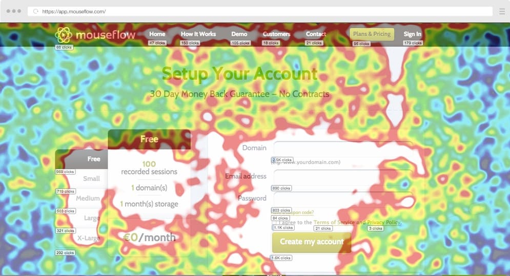
Incorporating behaviour tracking tools, such as Mouseflow, Fullstory, Mixpanel, Crazy Egg and Hotjar, allows you to see where your customers are spending the most time on your website.
Some tools generate a heat map of your website to determine where users' mouses linger or which links they click on the most.
If customers are significantly looking at or buying from one part of your website over another, it may be worth considering focusing on the more popular products or services.
Use social media for social listening
Social media is the perfect place to see what people are saying about products and services that you sell or that are similar to your own.
Reviewing your own social media accounts, or those of your competition, gives you direct access to the thoughts and feelings of your customer base.
Popular social media platforms for small businesses
- TikTok
Check Google Trends for trending topics
Google Trends is a website that shows – in real time – what people are or aren't searching for.
Check the trends to see if a topic related to your business is trending.
If it is, now might be the perfect time to jump on the bandwagon and generate leads.
Ask your customers about themselves!
You don't need to be a mind reader to determine what your audience wants. Your customer knows what they're looking for and they'll probably tell you if you ask.
Asking your customer "How can we help?" or "What do you need?" might be the clearest way of learning which areas of your business to focus on for the best return on investment.
To go deeper on this topic to see if you're nailing your message read our article on "How To Test If Your Website Is Broken"
Tip #3 - Add High-Quality Content and Visuals
Producing high-quality content and visuals seems like a no-brainer, but what does it mean really?
It's important to remember that small business websites have seconds to make an impact.
Low-quality or clashing design elements may sink your chances of making that impact before you are given a fair chance.
Beautiful graphics may catch the eye, but they alone won't guarantee a sales conversion.
Well written website copy may give your customers all the answers, but a plain and lifeless design may discourage them from even trying.
Instead, a cohesive design that ties in the brand image with original, high-quality graphics and content is the surest way to keep your customers' eyes on your small business website for longer.
Original media over stock media
While stock media is convenient, avoiding it ensures that your website has something that none of your competitors do: Original content.
Stock photography has a particular style that customers will immediately recognise and potentially label "generic".
Creating original content is a fantastic way of standing out from the crowd, i.e. your competition.
A professional website design agency has the technical knowledge to make this a reality and can advise you on creating fresh, original content as part of their website, graphic design or online marketing services.
Tip #4 - Don't be Afraid to Add White Space
The large chunks of text you see in print books and newspapers do not translate well online.
For customers who want a quick fix to their problem, a web page with a wall of text may seem daunting or not worth the effort to read through.
Making the most of white space reduces the perceived effort, making your content user-friendly and your website more attractive to potential customers - in the the industry we call this giving your visitors a good user experience.
Benefits of using white space
- Easier on the eyes; less effort to read
- Improves reader attention by reducing distractions
- It looks like a more professional website
Tips for using white space on a web design include:
- Break up larger paragraphs into shorter chunks
- Use a bulleted or numbered list if appropriate
- Keep your page margins from spreading too far
Tip #5 - Use Consistent Colour Schemes
The phrase "riot of colour" should give some clue into why controlling and limiting your colour palette in web design is a good idea.
We don't want a riot on our small business websites.
What we do want is to create a useful and memorable experience for potential customers. But bright, flashy colours aren't necessarily the best way to do achieve this.
Instead, choose a limited and consistent colour scheme that aligns with your branding. This will result in an effective and beautiful website for your small business.
Small business web design can become complicated, but working with a web designer or web design company can take the stress and hassle out of the design element and help get your website up and running sooner.
Tip #6 - Take Advantage of Video Content
There's a reason YouTube is one of the biggest websites in the world.
It's the same reason Facebook and Instagram have adopted video "reels" into their platforms.
It's because video content works.
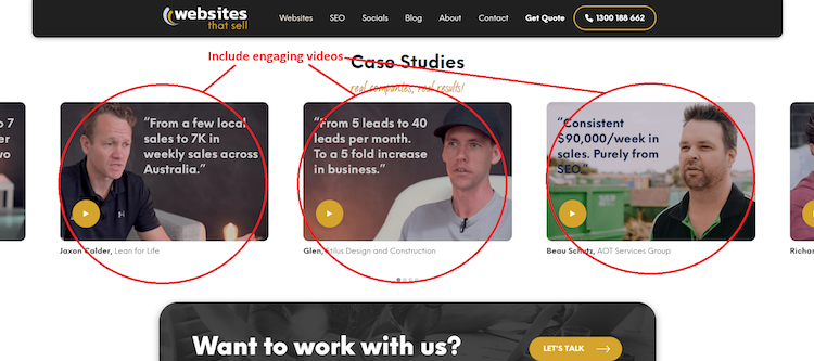
Videos are instantly engaging and require less effort to watch than it does to reading text.
Incorporate video in a variety of ways
- Introduce and personalise the business team
- Showcase your products
- Demonstrate how to use a product
- Provide further education about products or services
- Collect and feature video testimonials from clients
Tip #7 - Include Clear Calls-To-Action (CTA)
One of the most important questions to ask yourself is, "What do we want our customers to do?"
It might sound like a simple question but it's important to clarify what actions are most important for your audience to complete.
Do you want your customers to…
- Subscribe to a mailing list?
- Share a web article or blog post?
- Call or email for a business quote?
- Create a profile?
- Buy a product or book a service?
Successful small businesses know exactly what they want new customers to do. They tailor their web design accordingly to lead and then prompt the customer to the desired action.
Best places to add a CTA on a small business website
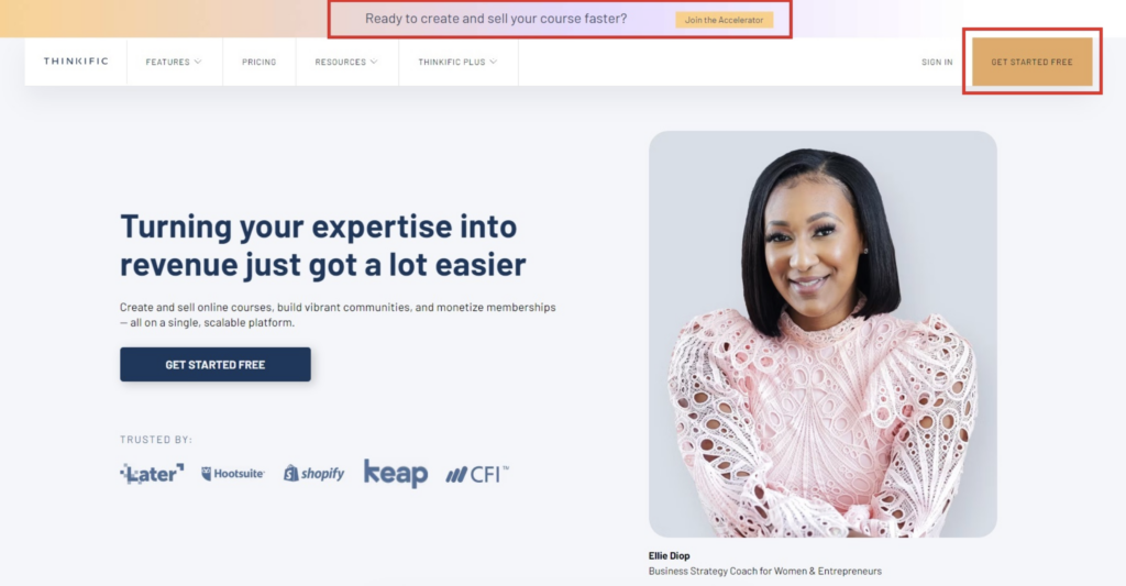
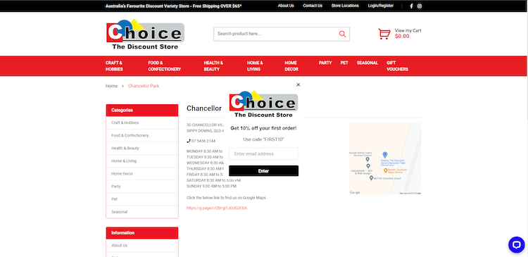
In the Header & Navigation Bar
The header and navigation bar are the main places that the eye will follow.
The biggest and the boldest headings or branding logos will naturally draw the eye, making it a perfect place to encourage your customers.
Within your page content, as an eye-catching button or link
This can be instantly eye-catching, by adding a link or button that diverges from the colour palette or stands out in some way.
The standard appearance of hyperlinks is blue and sometimes underlined. It's ok to change your hyperlink colour as long as it clearly stands out from your copy.
Footer & Sidebar
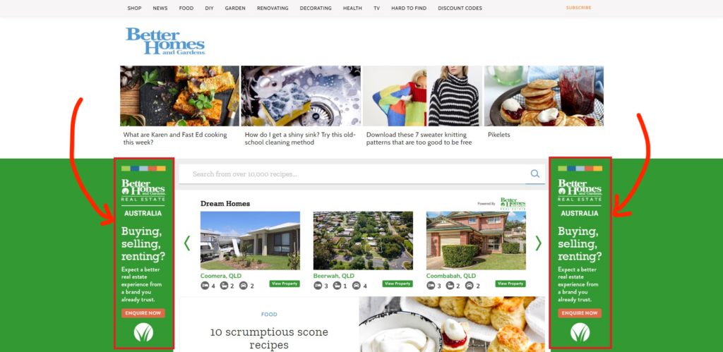
Placing the CTA outside the main content in either the footer or the sidebar means it won't interrupt user flow.
When your audience reaches the end of a page, blog post or video, the CTA button will be there in the footer to prompt them towards their next step. Then, they won't need to scroll back to the top of the page to take action.
Above The Fold
Above the fold refers to the part of the website that loads and is immediately seen without the user scrolling down.
This is a fantastic way to get the customers' attention quickly as soon as your home page loads.
An immediate call-to-action, especially if paired with an offer, can put your customer in a positive mindset regarding your product or service.
At The Bottom
You might be thinking that the bottom seems an unlikely place.
After all, most people won't scroll all the way to the bottom of the page.
While that is true, placing a call-to-action at the bottom filters out those customers that don't need to follow up the call to action.
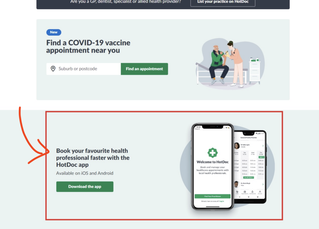
Think of a doctor's website with a blog post about specific medical symptoms.
At the very end of the list, a call-to-action to make an appointment is entirely appropriate, as people identifying with those symptoms will likely have been the only ones to scroll to the end.
How to create a high-converting CTA
The best ways to encourage your customers to follow through on the call to action is:
- Make it stand out from the rest of your website
- Add it to content that naturally leads to the desired action
- Let potential customers see your website or content before the CTA pops up
- Include a free giveaway, such as an eBook, free PDF or other service
Tip #8 - Incorporate Social Proof
Big businesses have whole teams of employees that manage their PR, brand recognition, and reputation.
As a small businesses, you may have more limited resources for establishing a strong brand identity and reputation. To help simplify this task, use your existing customer base to help promote your services or products!
Incorporating social proof into your small business website design is a great way to establish credibility for your products or services. You can do this by adding reviews, comments and ratings to your pages.
By featuring these types of social proof on your website, you'll provide clear evidence to potential customers that your previous customers are satisfied with your small business.
Take a deep dive on this topic by reading our guide on Increasing User Experience By Building Trust With Customers.
Here are some examples of social proof…
Testimonials
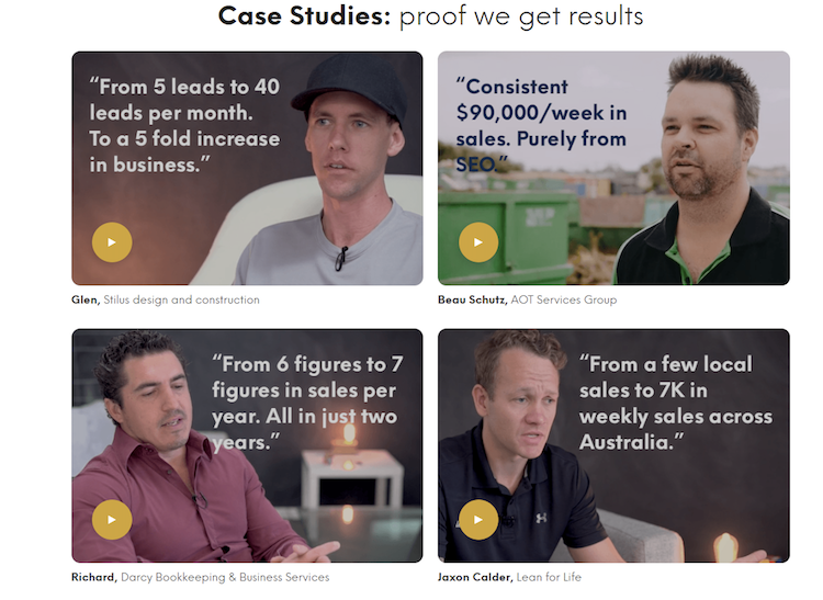
Testimonials from past customers or clients are direct social proof that your small business is reputable and respectable, gives good value and is worth repeat custom.
Testimonials can be given in a number of ways:
- Written testimonials (comments on your Google Business Profile or social channels)
- Video testimonials (product reviews on YouTube)
- Quote testimonials (direct quotes on your website from customers)
Social Media Shares of Your Business
Online marketing services are among the best kind of marketing.
Personal endorsement from your customer base is an honest and reputable rating of your products or services and can include the benefits of:
- Customers' personal endorsement and experience
- Encouraging inter-customer conversation
- Customers endorsement of your services
Tip #9 - Optimise Your Site for Mobile Devices
Good websites need to be accessible anytime, any place.
Gone are the days of relying solely on big Yellow Pages books.
Now, we turn to our personal mobile devices for unlimited information.
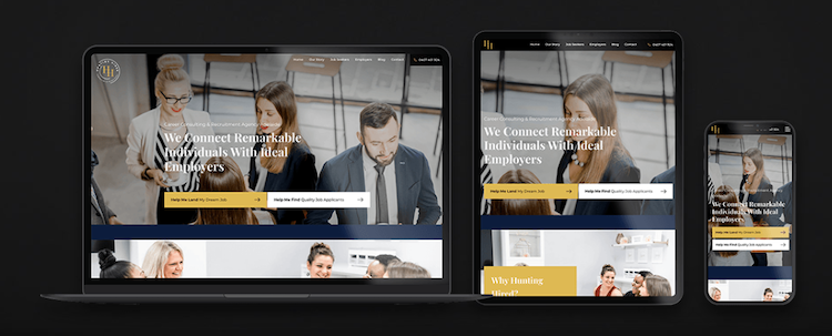
Making websites mobile-friendly and mobile responsive is critical to getting your small business website seen.
Research conducted by Google found that 53% of mobile users will close a website if it doesn't load within the first 3 seconds.
Slow websites also increase customer frustration and impatience, something we certainly don't want to be associated with our brands.
Choosing a good website host during web development is a key factor in ensuring your small business website responds quickly and reliably and remains online and accessible.
Your content management system may have options for condensing the image size.
Talk to a website developer to discuss how to make your website mobile friendly.
Benefits of responsive website design for small businesses
- Customer retention
- Increased visibility
- Increased sales and ROI
Tip #10 - Create an Intuitive Navigation System
No one wants to spend longer than they have to looking for information about a product or service.
A web design incorporating an intuitive navigation system will improve the chances for small businesses to retain customers.
Make sure it's easy for customers to find information
It's crucial that customers can easily find the information they seek. A well-structured navigation system and clear categorisation of content makes the journey smooth and intuitive.
Think of your website as a library. Each page is a new shelf with its own organisational structure and labels.
By placing important information in logical locations, providing search functionality, and implementing user-friendly menus, businesses can empower their customers to effortlessly navigate through the virtual corridors of their website.
Drop down menus
Using a drop down menu (or more than one) to showcase your products or services on the same page as your main content.
Drop down menus may have more than one layer of categories, giving your customers quick and easy access to your product or service range.
Use a proper domain extension
Your domain name will lead to your home page and additional pages on your site will be an extension of that domain.
Using proper domain extensions to describe blog, about, contact or product pages will help your customers know where they are within your site.
Bonus Tip: Hire a Website Design Agency to Do the Heavy-Lifting for Your Small Business
Hiring a web design service to help you implement all the tips above will ensure your small business thrives.
If you're located in Brisbane, the Gold Coast, Sunshine Coast, or anywhere else within Australia, Websites That Sell can help increase your visibility, search ranking, and customer conversion.
We provide comprehensive web design services and search engine optimisation to ensure your brand stands head and shoulders above the competition.
